
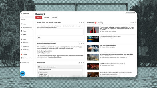
Log into your dashboard and it’ll look different. We’ve refreshed the design of the LexBlog Platform—same tools, same navigation, new coat of paint.
We were after a more modern, airy feel. White surfaces replace the old dark grey sidebar and grey canvas, lighter borders do the separating and your post lists carry less visual noise. LexBlog red still shows up, just in fewer and more deliberate places.
A few additions came with it:
- Quick actions at the top of the dashboard for New Post, New Page and Edit Profile
- Support Center and My Account as their own items in the sidebar
- The editor toolbar sits at the top of the screen by default. Switch it back in your personal options if you prefer it inline.
Nothing moved. No features were added, removed or relocated. If you knew where something was yesterday, it’s in the same place today.
The refresh arrives alongside your upgrade to WordPress 7.1. Keeping every blog on a current version of WordPress is part of what we handle for you, and we manage those upgrades deliberately—testing first and timing them against our own work—so you get what’s new without unexpected issues.
This is one piece of ongoing work on the platform. Next up is the same treatment for the site settings and user profile screens, and we’re looking at adding a dark mode.
A change this broad touches a lot of screens, and we’d rather hear about the rough edges than let them sit. If something looks off—a color that doesn’t fit, text that’s hard to read, a button that’s lost its styling—let us know at [support link] and we’ll get it sorted.